|
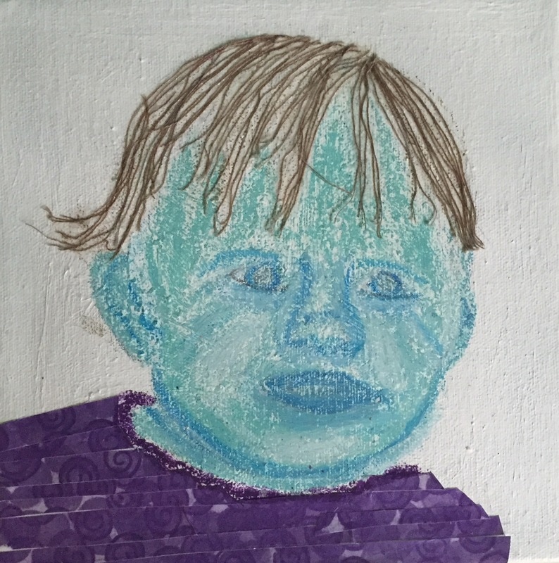
For my portrait project I used oil pastels to make the face in blue, I used string for the hair and I cut paper to make the shirt. To make this portrait I started with the face and just drew the shape and outline of the face. Next I started with the lightest shade of oil pastel and eventually i built up the shading and color. Then I moved on to the hair and I pulled the yarn apart into thinner strands and glued them onto the head with the gel medium. The last thing I did was cut out some strips of paper and glued them down with gel medium. This picture is of me as a baby and I chose this picture because I thought it was really cute and not many people in my class chose to do themselves they mostly did someone else.
0 Comments
Required Questions 1. The art criticism process is a 4 step process you can use to observe and critique art pieces. The first step is to describe the piece and just observe and tell what you see as you look at the piece. The second step is to analyze the piece and use the art elements and principals to reflect on the art and critique. The third step is to interpret the art and think about what the art is trying to say, what caused the artist to say it, what is the historical meaning that surrounds the art and why was the work of art created in that specific style. The last step is when you decide how successful the work of art was in your eyes. 2.
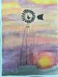
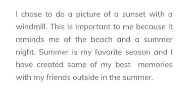
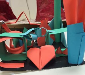
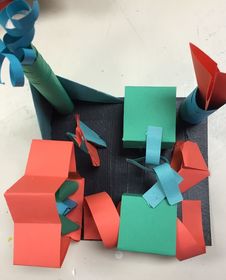
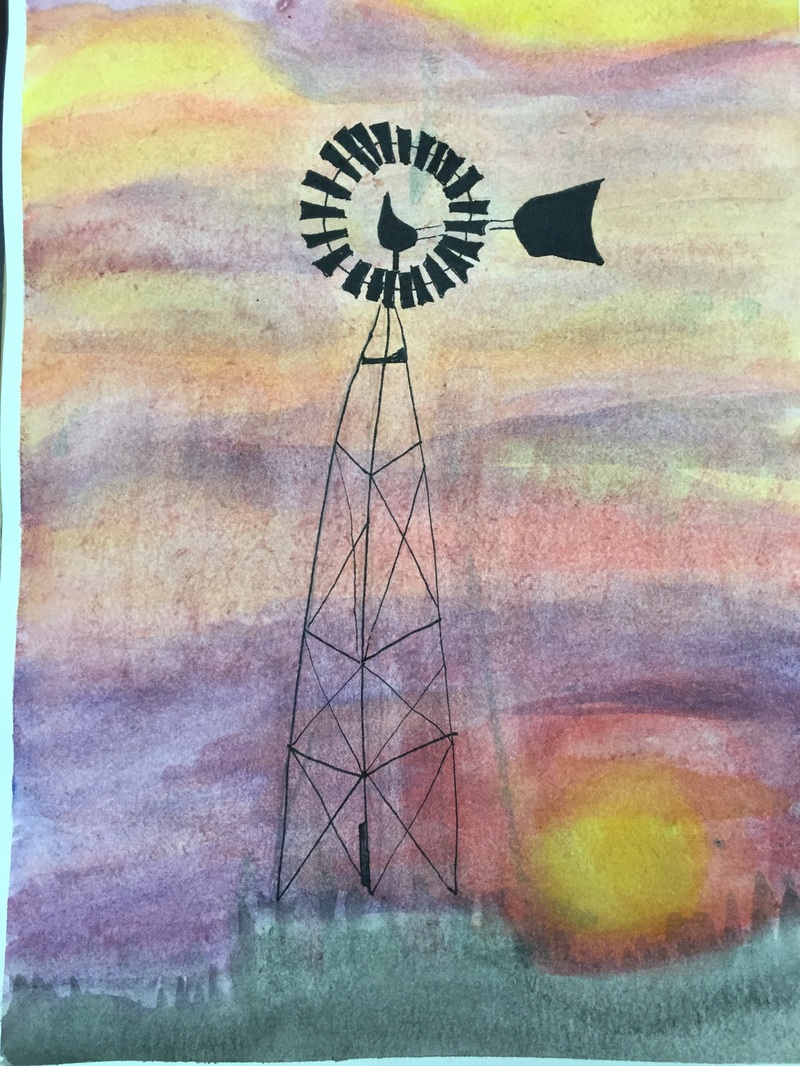
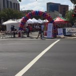 An art festival that I went to An art festival that I went to 3. Describe- I see a sunset watercolor painting that is a blend of many warm colors with the contrasting color of purple to make it pop. Then I see the wind mill drawn in sharpie pen to make it stand out. Analyze- In this piece the colors are blended well but I think they could have added more oranges and yellows to lighten up the lower half of the painting. Also the sun looks good and blended but the red could have transitioned to the purple a little better. The windmill is very clear and crisp and well drawn and it brings the whole piece together. Interpret- I think this painting was supposed to represent summer and relaxation because of the warm colors that make you feel relaxed and calm. I think the artist was trying to say to relax and the sunset also represents the end of the day and completion of work. Success- In my eyes this piece was pretty successful because the composition is good and the color scheme is well done. The one thing I would change is to take a little more time to make the windmill lines more straight and just make sure that the colors are more even. 3 Questions that I picked 1. What is Art? To me art is whatever you want it to be. Art is and expression of your emotions, feelings and personality. It's you putting your thoughts or ideas into a physical form for others to reflect on. Art is a way for you to share your ideas with others and for people to communicate. Art is universal and anyone can feel a specific way about any art. Art is something anyone can look at have feelings about. Art is inspiring work that can come in any form. 7. What is the point of this class? What did you get out of it? For me this class was about learning new art techniques and trying something new. This class was to be able to move onto other art classes and be able to continue my art journey. This class was to learn new forms of art and learn about artists and lots of other ways to express yourself. I got a lot of new ideas and thoughts about art and I also learned a lot about what art I like to do and what I struggle with. 9. Illustration Fridays have been completed almost every week this semester, do you feel this assignment helped you brainstorm for main project or helped you skill levels in any way? Why, or why not? I think illustration Fridays helped me expand my skills and practice some of the new techniques I had learned. I think they were very helpful because they helped you be more creative and try to think of something to draw based on a word given. I would also try to draw something different than everyone else so no one would have the same drawing as anyone else. I also think it helped me to not procrastinate even thought I missed one or two drawings. It makes you create something every week so you can take your mind off he project you are working on and do something different. 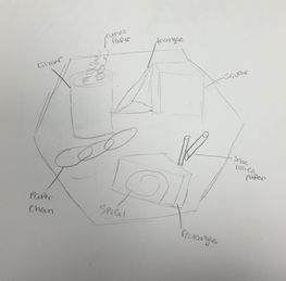 Full page sketch Full page sketch For this project I chose to make a paper sculpture because I thought it would look cool and I didn't do many projects with paper in this class so I wanted to try something new. To start this project I had to pick the color scheme of paper that I wanted. I went for the cool colors and a contrast color to change it up a little. Then I also chose what I was going to make the base of my project out of and I got come poster board and painted it black. Next I looked up some techniques on how to make small paper sculptures and shapes. Then I folded the paper and glued them onto the board with a hot glue gun. I just kept folding and adding more and more until the base was filled.
I think that the color scheme and the variety of shapes was successful in my piece and if I was going to do this project again I would try to make the hot glue not show as much in my piece and I would plan out where I would put what instead of just figuring it out as I go along.
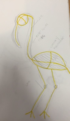 Link to my 20 insirational images-https://www.pinterest.com/madisonpetschau/paper-mache-animals/ Brainstorm paper mache- - Chamelion - Dragon Fly - Flamingo - Headgehog - Giraffe - Cactus - Piggy Bank Paper mache tutorials-
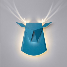
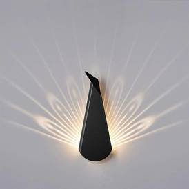
- http://www.wikihow.com/Create-Papier-M%C3%A2ch%C3%A9 - https://www.youtube.com/watch?v=KaLmdRBvGG4 Materials needed- -Glue -Wire -Water -Plastic bags -Newspaper -Paper -Tin foil -Sand paper Chen Bikovski is my inspired artist she works with thin aluminum to make her sculptures. Chen's inspiration for her recent art is her childhood because when she was little she always love the pop up book and she wanted to incorporate that into her art. So she decided to make animals into permanent light fixtures that when you turned them on the features lit up. Chen's work is inspiring to me because she takes something so simple and makes something so amazing. I think that lots of other people like to relate back to childhood and that makes her work very relatable. Chen Bikovski- http://popuplighting.com/pages/about
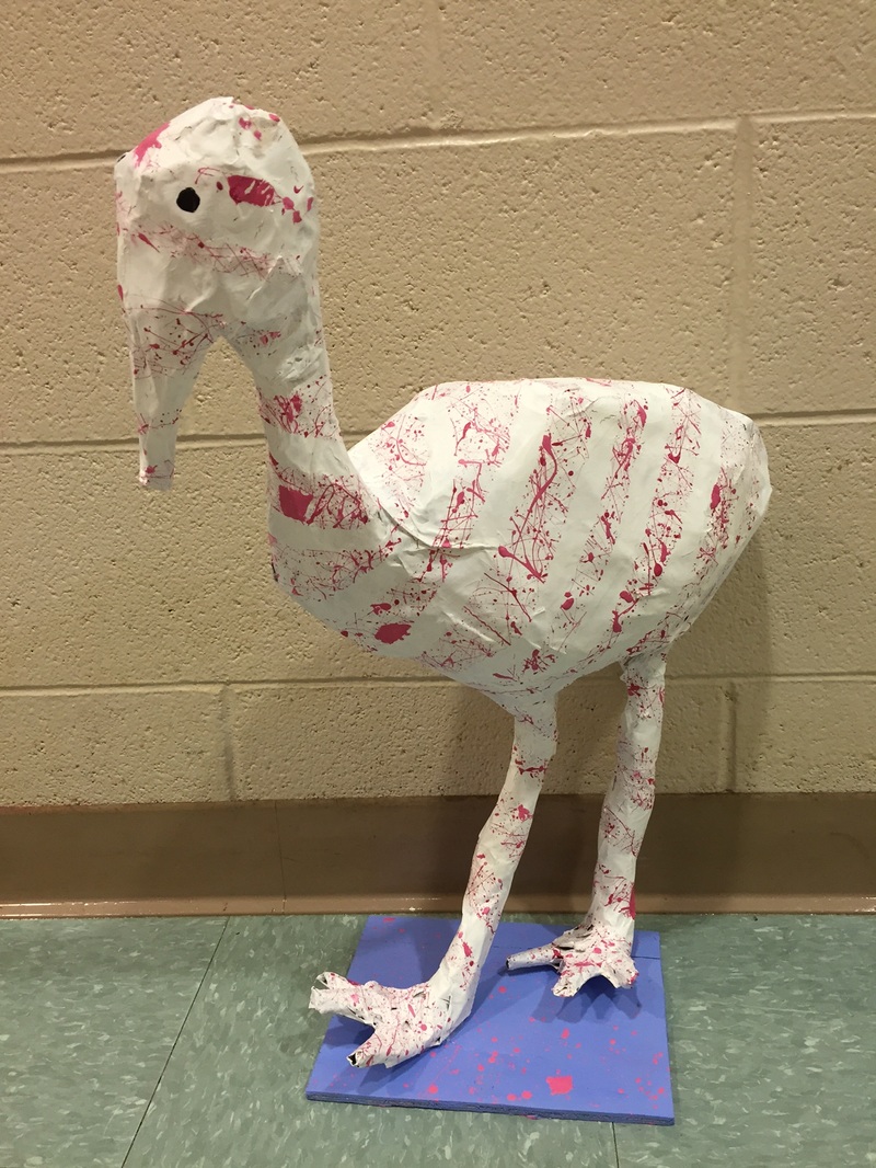
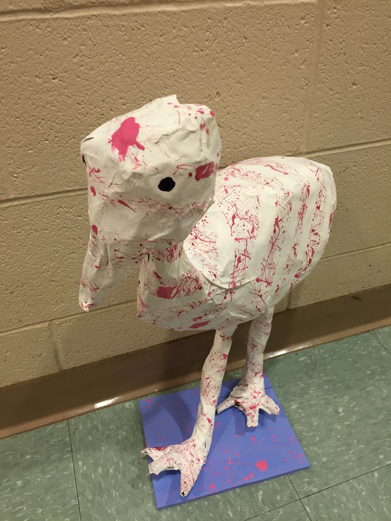
I made a flamingo out of paper mache for my sculpture project. To do paper mache you have to make the armature and the basic shape first then you stuff the wire shape with paper and bags. After you get the shape you have to start paper mache and cover the whole thing. After, you sand it out to make it smooth then you paint it. I did a paint splatter and so I taped off certain areas that I didn't want to get paired and then splattered different shades of pink on it. I was inspired to create this piece because I wanted to make something that was as close to life size as I could get and I wanted to make an animal becuase I love animals and I saw many ideas on pinterest of paper mache animals. The most successful part about my piece was the overall shape and the painting of the flamingo and the thing I would change is to make it stand up I didn't really think about that and then I had to put a stand on it to make it stand up. Yes, I would sign up for sculpture class because sculpture is my favorite type of art and I just like 3D art and things you can actuallyy touch. 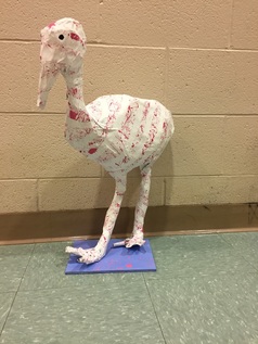
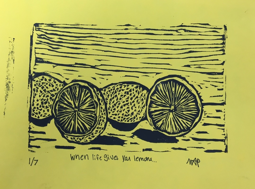
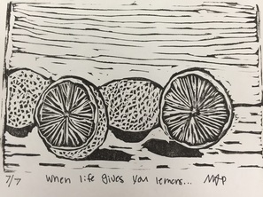
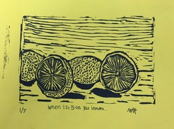
My piece is of lemons and I incorporated line in this piece with the texture of the lemons and in the background. Another place I used line was on the lemons that aren't cut the texture of the peel. To make this stamp/print you first have to draw out what you want to carve, then scribble with pencil on the back and place your linoleum block underneath and draw over what you already drew. The drawing will transfer onto the block, next you trace it with sharpie so it doesn't come off. Then you will carve out what parts you want to be white when you stamp it. After you are done carving you will get a metal plate, ink and a roller. You roll the ink on thee metal plate until it gets sticky and you can hear it when you roll back and forth. Then you roll the ink onto the carved piece and line it up on your paper and rub the ink into the paper and peel the paper up and yo have your print. This piece was very successful and i really like how the little details look. The only thing I would change is to make the shadow on the smaller lemon more defined and extend it a little.
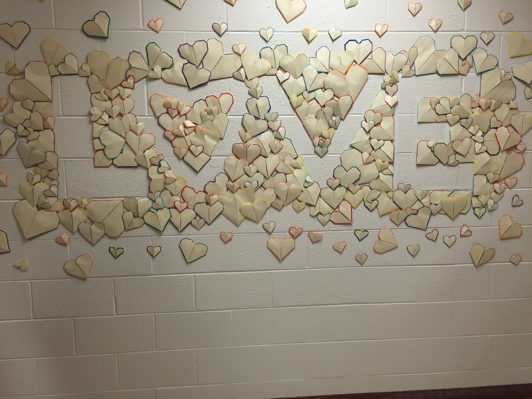
For our installation project we wanted to spell a word using origami shapes. So we tried stars first and realized that was to hard so then we switched to heart and everyone could make those. I think this instillation was very successful because everyone did a small part of this project and then we put it all together and it worked out. The one thing I would change if we did this project again I think we should have painted the hearts or used colored paper to make the paper not blend into the wall so much.
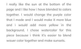
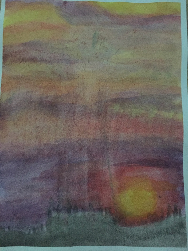
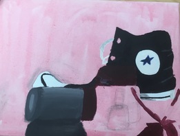
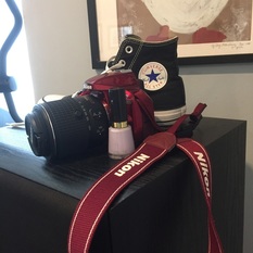
I really like the sun at the bottom of the page and I like how i have blended to colors together. I would change the purple color that I made and I would make it more blue and i would add more yellow in the background. I chose watercolor for this piece because i think it's easier to blend wauer color together and make sunsets. 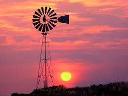 This is the original picture I was referencing For my still life I chose to do a converse, camera and nail polish. I chose a converse because i wear them almost everyday. I chose my camera because I love photography and nail polish is the last thing I included because I love to paint my nails.
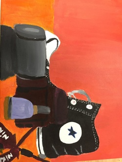 The most successful part of my painting was the converse because I think it looks the best and has the most detail. I also really like the camera straps because they have look more realistic. The one thing I would change is the nail polish that's my least favorite part of my painting i just messed up the shape when I drew it. For my painting I chose to do acrylic becuase it easy to blend and add detail. For my piece I needed lots of details and for my water color it was more blended so i wanted to use acrylic for this piece.
|
AuthorI love to swim and jump rope. My favorite style of art is sculpting and making 3D art pieces. Archives
January 2017
Categories |


 RSS Feed
